LOGO
Putting emphasis on product bundles and ease of use.
Logo is the direct to market insurance brand of Tranquilidade.
The brand refresh aimed to put greater emphasis on Logo’s way of doing things: painless, modern and accessible.
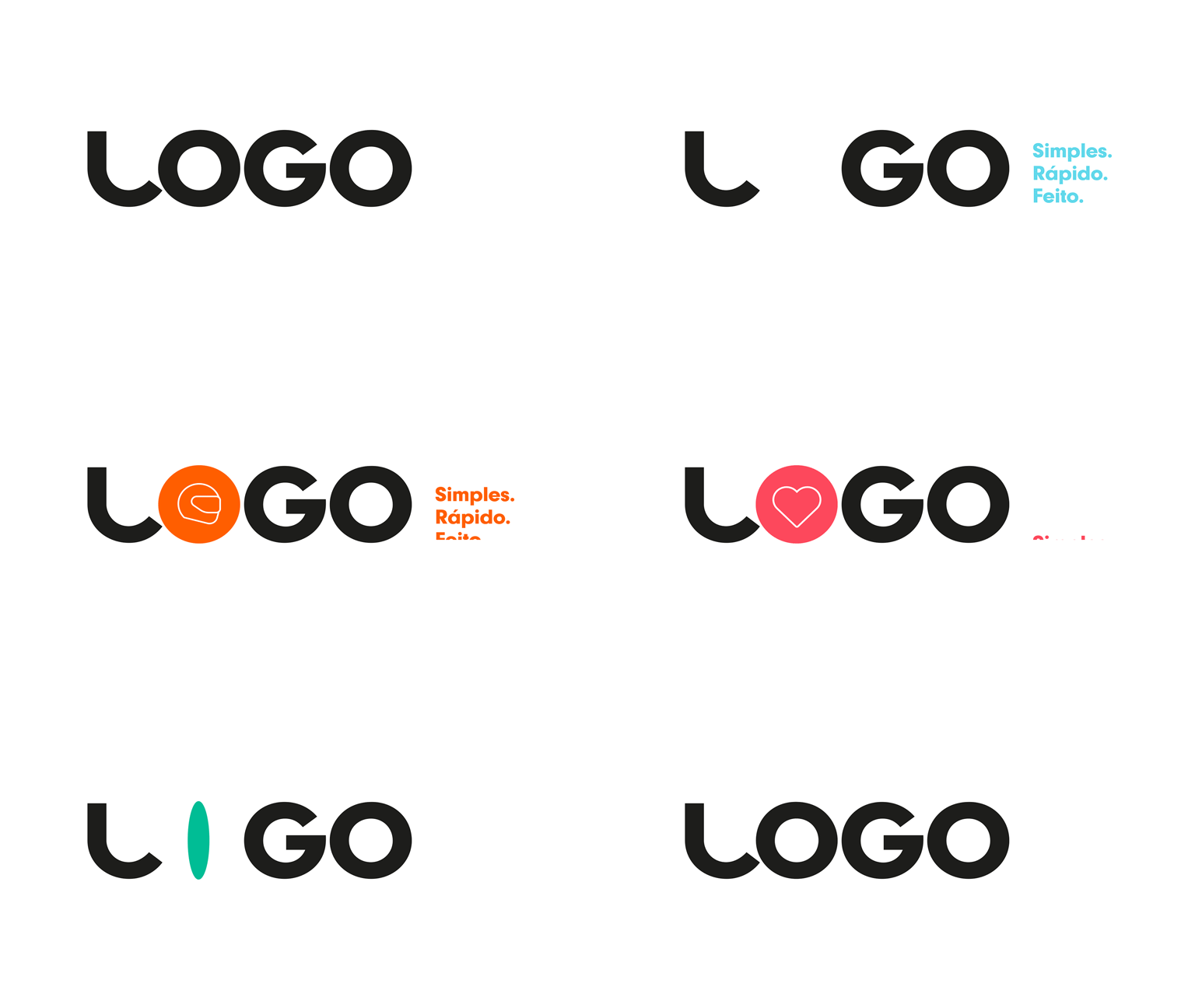
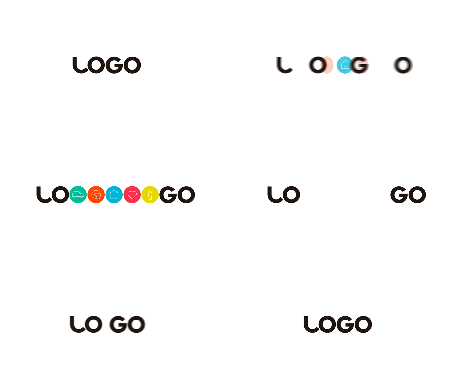
A new logo system and iconography was developed which communicated Logo’s specialism in five main areas of insurance: car, motorbike, house and contents, medical and life. A new colour palette and coding system was introduced which is friendly and upbeat.
The launch campaign compares everyday situations with the simplicity, speed and cost of buying insurance from Logo. The is summed up in the strapline Quick, Simple, Painless.
All the TV adverts can be viewed here.
This work was produced in association with Kayak Lisbon.
Brand strategy / Visual expression / Visual design / UX/UI design / Art direction


