HOTPOINT
Reviving an iconic British brand.
Hotpoint was an established British brand that was gradually being seen as being old-fashioned and outdated (for my mum). A large scale investment was being made by parent company Indesit, together with the launch of an extensive new product range. Cost saving synergies were sought with the Ariston brand which had been revitalised a year earlier.
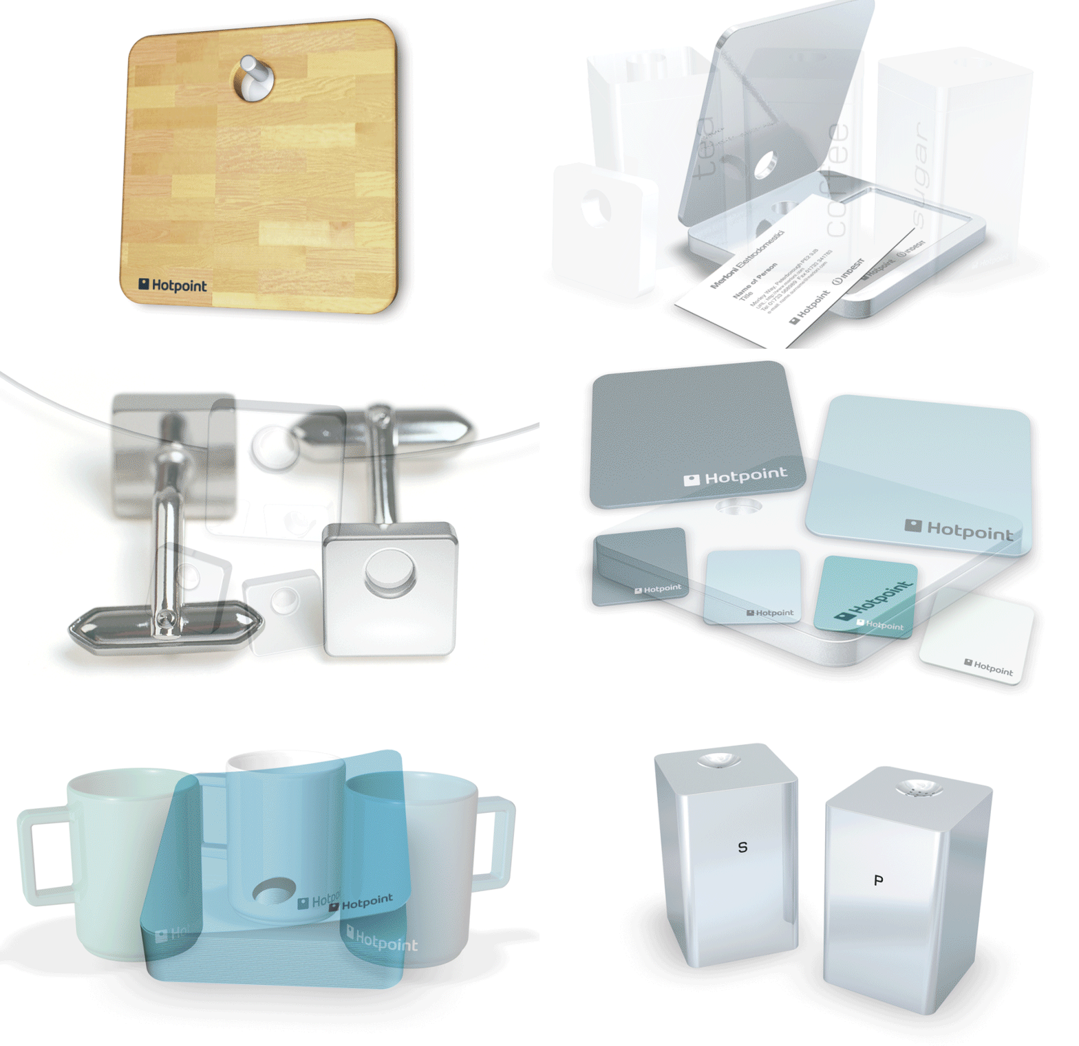
A distinctive tone of voice was developed to support the brand idea of ‘Designed for the Real World’. A new pictogram and photographic style also supported this idea. The photographic style was based around the domestic landscape of the UK. A new simple brand mark was also developed. The original blue of Hotpoint was retained but used in a deeper, more sophisticated form.
This work was carried out while at Wolff Olins.
Brand strategy / Visual expression / Art direction.


